Among the many small but noticeable quality-of-life improvements Microsoft made to Windows 11 with the release of 22H2, some of the most notable involve the Start Menu and its organizational capabilities. Improvements to grouping features, pinning protocols and recommendation suggestions give users much more personal control and flexibility over how the Start Menu feels and works.
SEE: 100+ IT policies at your fingertips, ready for download (TechRepublic Premium)
Microsoft has chosen not to prominently advertise these improvements and instead let Windows 11 users discover these new features for themselves. We will remedy that slight oversight with a quick tutorial on what Start Menu features have changed in Windows 11 22H2 and what those changes mean for you and how you work and play.
Start Menu feature improvements in Windows 11 22H2
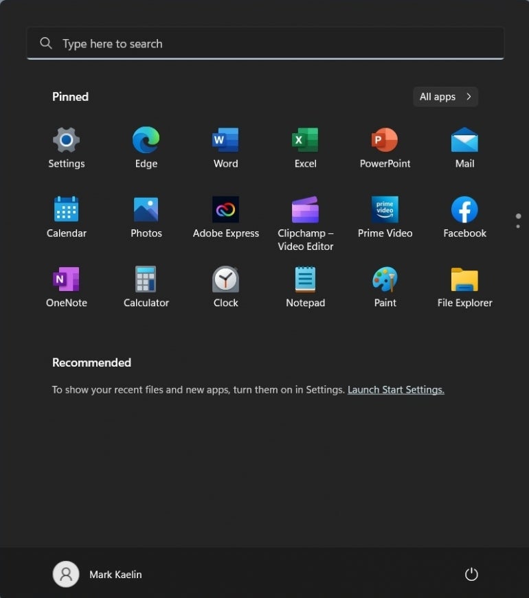
Figure A shows you what the Windows 11 Start Menu looks like in its default mode with all the additional features turned off. Take note of how unorganized and haphazard the pinned applications on the Start Menu are displayed.
Figure A
The first step toward getting the Start Menu more organized under Windows 11 22H2 is activating display features in Settings. Open the Settings app and click the Personalization item in the left-hand navigation bar. Scroll down the right-hand list and click the Start item (Figure B).
Figure B
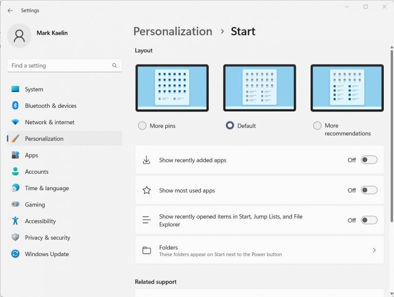
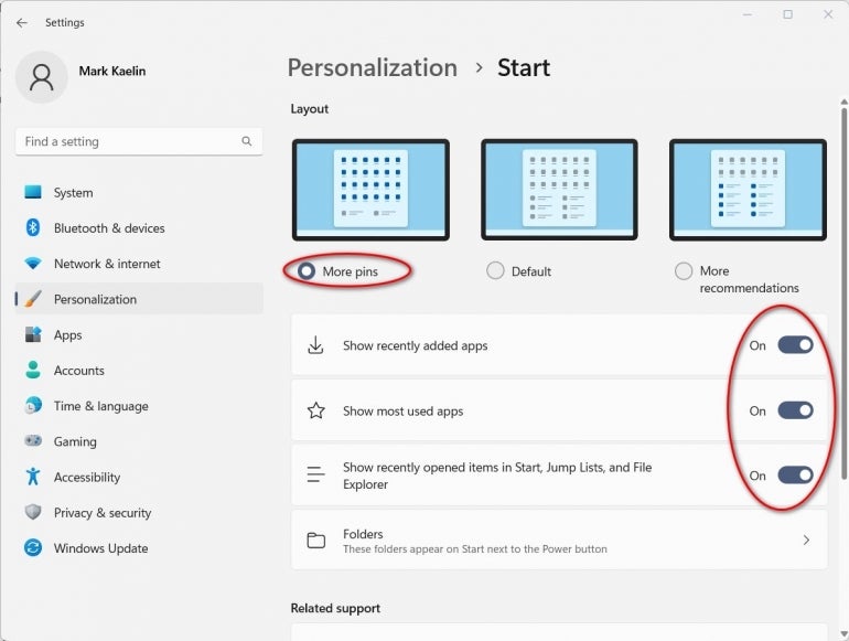
The first section on this Settings page allows you to change the layout of the Start Menu. Personally, I prefer to display as many pinned apps as possible while squeezing out the Recommendations section. You may choose to do the exact opposite or keep the default.
You may also want to turn on the three features listed on this page to provide more variety to your Start Menu (Figure C). The choice of what features to use is yours, but I’d recommend activating the Show Recently Added Apps feature since it will give you an opportunity to pin new apps after you install them.
Figure C
When you have made your decisions for this page, exit Settings and then open the Start Menu in Windows 11 again to see what has changed. As you can see in Figure D, the pinned section has grown significantly while the recommended section has shrunk.
Figure D
While we now have more pinned apps displayed on the Start Menu, they are not well organized or conveniently grouped. With the release of Windows 11 22H2, we can remedy that problem.
You can drag and drop the app icons anywhere you want on the Start Menu, but Windows 11 22H2 adds another organizational feature as well. We will group all the Microsoft 365 apps into their own single apps folder. This will free some space in the pinned section of the Start Menu for other apps.
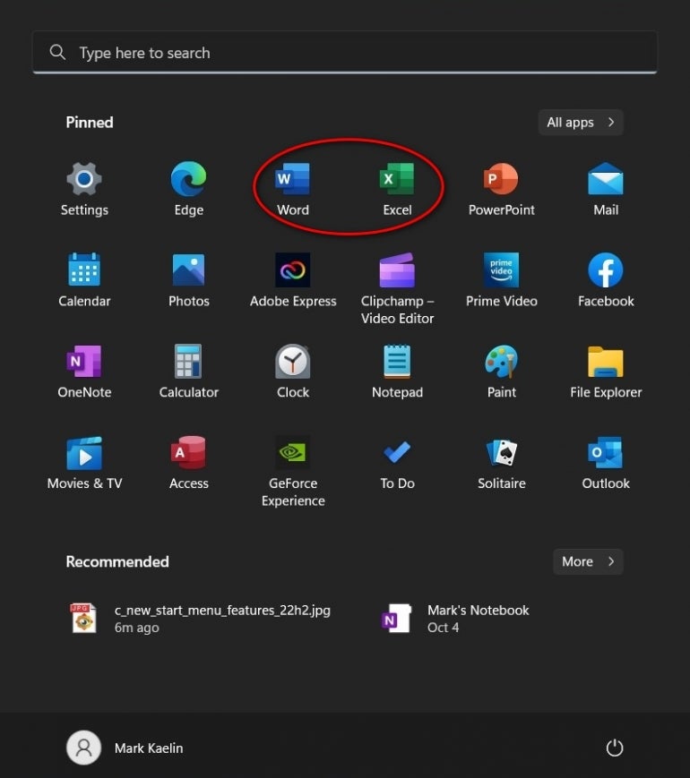
Using your mouse, click and hold the icon for one app (in this example, Excel) and drag it on top of another app icon (Word) and drop it there. As you can see in Figure E, those two pinned apps will now form a single pinned folder containing both applications.
Figure E
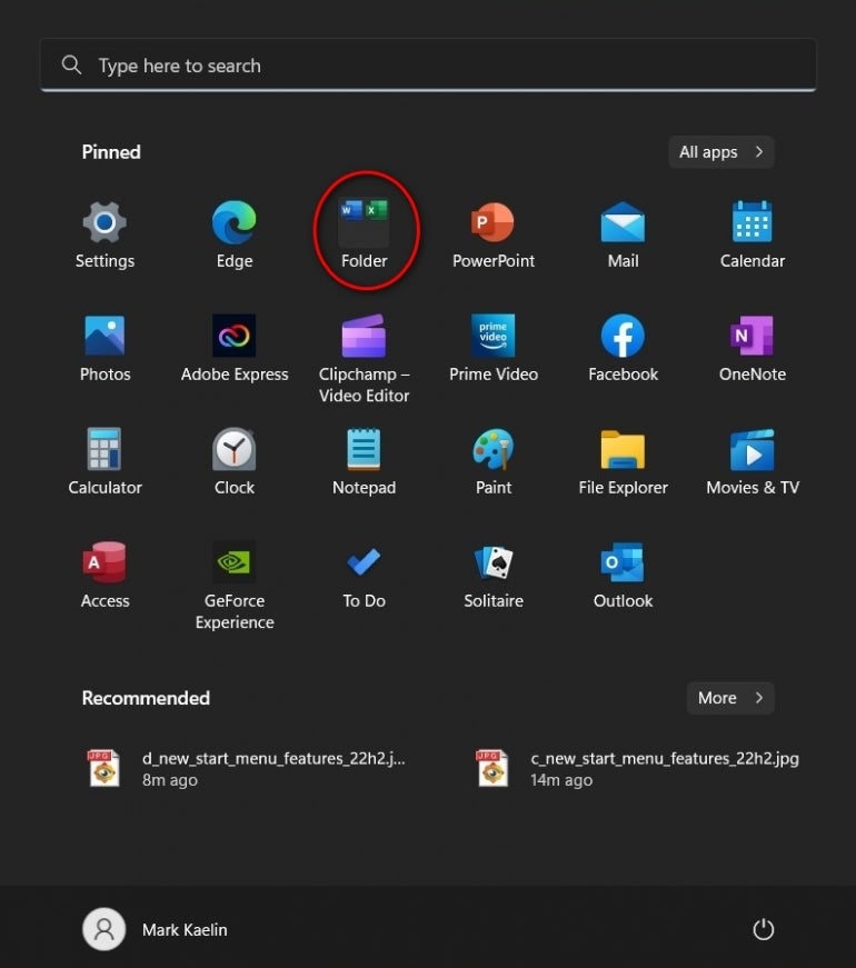
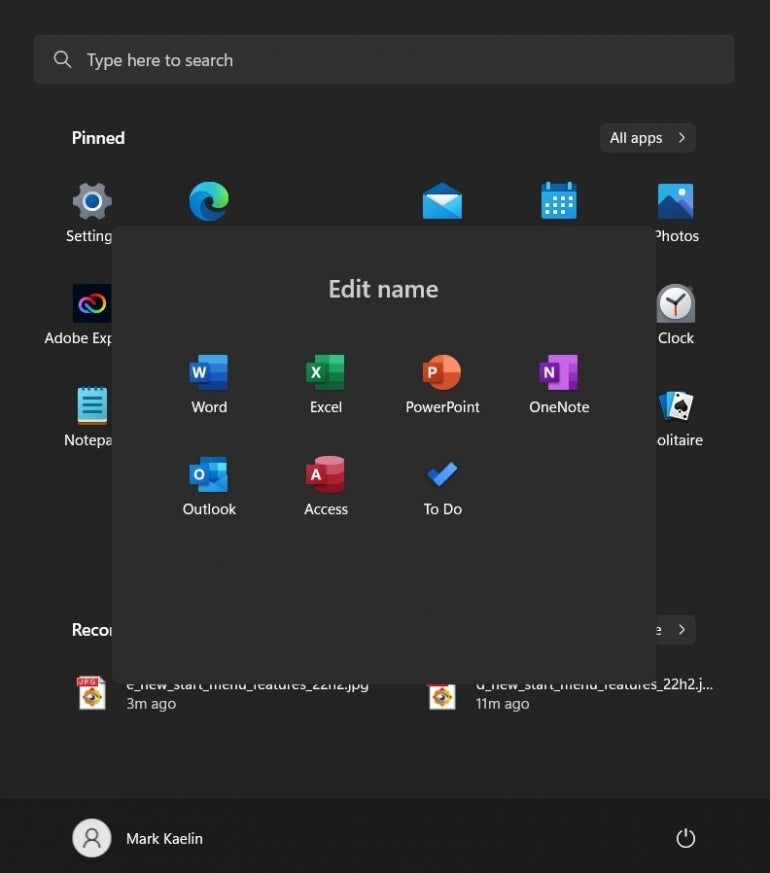
Perform this same drag-and-drop procedure for all the Microsoft 365 apps and you will create a single icon which contains all those productivity apps in one central pinned location (Figure F).
Figure F
This process has also freed a whole row of spots on the Windows 11 Start Menu where we can pin other applications. With this technique, you could group similar apps together based on any criteria you choose, giving you the power to organize and personalize the Windows 11 22H2 Start Menu as you see fit.
